Part 1
By Jeff Sonas
During my years of working with FIDE on its rating system, I have built up a large database of historical game results and rating lists. Often I use this database to recreate the historical rating calculation under various alternative rules, so that for instance I can see which K-factors or other parameters would have yielded ratings that were most “accurate” (by which I mean they were most highly correlated with subsequent game outcomes). However, there is another line of research that is just as valuable as parameter optimization, and probably even more informative: slicing the actual historical data into various views and visualizing the data from those different perspectives.
If done well, this data visualization allows us to deepen our overall understanding of what has actually happened, and continues to happen, within the rating system. I have been developing such views on the data in recent weeks, and I would like to start sharing my findings and my graphs. It will take several articles, so this is just part 1. In most cases, I have extended my analysis back 40 years into the past, so that we can understand not just where we are now, but also how we gradually got here. At the end of this article, I go into some detail about where the data for this analysis came from, but if you’re not interested in that, let’s get started!
First of all, it is useful to understand the overall distributions of player strengths, and how that has changed over the years. It used to be that the minimum FIDE rating was 2205, although there were some women’s ratings allowed to be as low as 1805. But more recently, this minimum has been gradually lowered, by a single “class interval” (200 points) at a time, to the point where the minimum is now 1000. So a rating pool that was originally about two “class intervals”, spanning from 2200 to 2600 during the 1970’s, is now more like 9+ “class intervals”, spanning from 1000 to 2800 (or even beyond). In the following graph, I have assigned different colours to different class intervals, so you can see how the populations have changed over time:
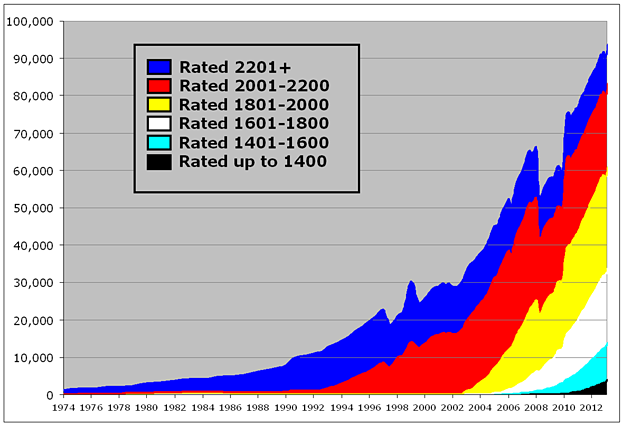
So we can see that for many years, the rating pool was almost exclusively blue players (rated above 2200), then over time it has added more red players (rated 2001-2200), yellow (rated 1801-2000), and so on, up to the present where we have a few thousand players rated below 1400. Remember that this graph only depicts counts of the “active” players – you lose your active status if you go long enough without playing any rated games, and I think that is why the graph looks funny between 2008 and 2010 (the rules changed around then for what constitutes an “active” player). Also, you will notice that the number of active players rated above 2200 actually hit its peak about 5-10 years ago, and is steadily decreasing. This will be important to remember when we discuss the topic of “rating inflation”, in a later article.
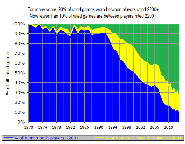
With the steady reduction in the minimum rating, and the fact that we are actually losing players from the top group, of course, the average player rating is steadily decreasing as well. Currently, there are roughly twice as many players rated below 2000 as above 2000; the exact reverse was true only six years ago. Another way to look at this is to count up all of the rated games that were played and to see how many of them are “master” games — played between players who were both rated 2200+. For many years this was almost 100% of games — certainly that was true during the time the Elo system was invented and when Arpad Elo wrote his book in 1978. But it is not remotely true anymore. In fact, now fewer than one game in ten involves both players being rated 2200+, and 70% of all games are played between players who are both sub-2200:
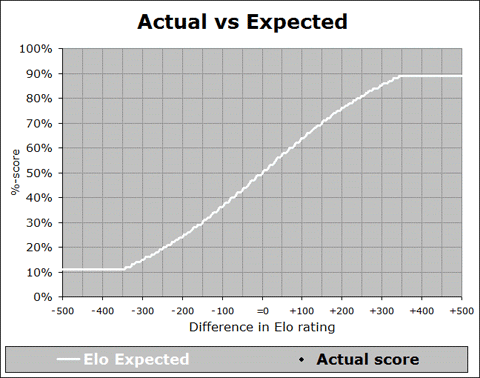
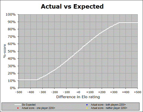
These changes are important to keep in mind whenever we look at overall averages across the entire rating system. For example, in a recent meeting with FIDE Qualification Commission (QC) members, we looked at a somewhat disturbing graph, showing whether the distribution of actual game results aligned with the theoretical Elo expectation (as represented in the Elo expectancy tables used by FIDE for calculation of ratings):
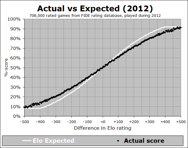
In the above graph (which you may have seen previously in my writings), the white line represents the theoretical Elo expected %-score, across the range of possible rating differences, and the black dots represent the actual data – what players really are scoring (on average) when they have that rating (dis)advantage. So for instance, let’s look at the next image, which is zoomed into a particular part of the graph:
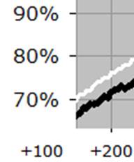
We see that when a player has a rating advantage of 200 points, they are expected (white line) to score 76%, but they are actually scoring (black line) about 72%. This is a pretty big difference - if you have a K-factor of 30 and you play 10 games against opponents rated 200 points below you, then the Elo tables will predict a score of 7.6, but your average score will be more like 7.2, leading to a likely rating loss of 12 points! And it is a general trend, when we look at the whole curve – the black line is shallower than the white line, indicating that rating favourites are not performing up to their expectation. This implies that if you play a lot of players rated significantly below you, you will likely lose rating points. Conversely, if you play a lot of players rated significantly above you, then you will likely gain rating points. This situation is less than ideal.
It raises two very important questions:
- Is this a recent development? If so, when exactly did it start happening?
- Is this happening throughout the rating system, or is it focused on one subset of the rating pool?
Let’s look at each of these in turn. First, is this a recent development? In order to answer this question, we need to start looking back into the past, and showing this relationship. I have developed an animated GIF, showing the trend over the past 40 years:
We can see from this animation that the overall trend, where the black line is shallower than the white curve, was happening way back at the start of the FIDE rating system in the early 1970’s, and it stayed in place until the late 1980’s, where the actual results started to line up with the expectancy curve. But then around the year 2000 it started to get too shallow again, and this trend continued right up to the present. And in fact, if you look at the last few years from 2008 to 2012, you can see that the slope of the black trace is getting more and more shallow, indicating (by this measure at least) that things are getting worse and worse, for all rating differences of 100 points or more.
However, the situation is not quite as gloomy as it might seem. You will recall that there is a far higher percentage of games played between players rated below 2200 than there used to be, a trend that will clearly continue since the number of players rated above 2200 is dropping and the number of players rated below 2200 is increasing. What if we looked at that same graph as above, but instead of having one black trace, we had three different traces, each representing a different set of games, depending on the strength of the players? I went ahead and generated a graph for this. To help you understand this new graph, let’s continue the earlier “zoomed-in” example at a +200 rating advantage:
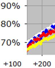
Again, the white line is at 76%, indicating that the Elo expectancy is 76% when you have a rating advantage of +200 points. But now, what used to be a single black trace has been split into three separate colour traces. In the above image, the blue dots represent the average of only those games where both players were rated 2200+, the yellow dots are for the games where both players were below 2200, and the red dots are for the “split” games, where one player is above 2200 and the other is below 2200. We can see that the blue dots (where both players are 2200+) are definitely closer to the prediction of 76%, and the red dots (involving exactly one player rated 2200+) are quite close as well, whereas the yellow dots (games between weaker players) are the real culprit here, showing down around 71%. Here is the full graph:
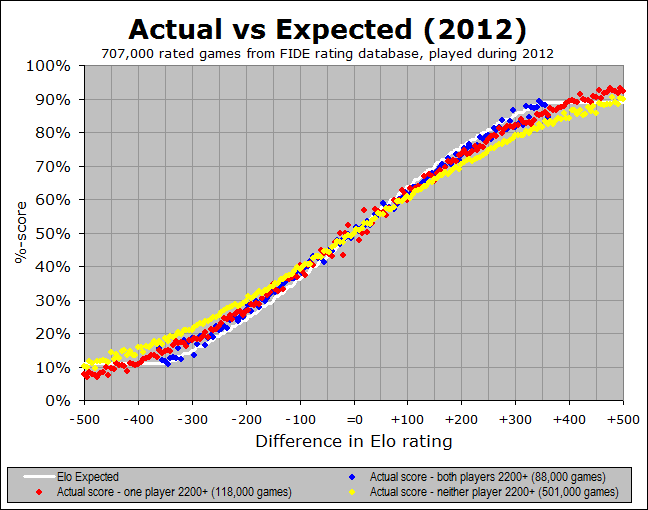
It seems pretty clear that the blue dots (both players 2200+) are the closest to the white Elo prediction, whereas the yellow dots (both players sub-2200) are the worst. So this means that the Elo system is working better for the top players than for the weaker players (I will delve into some possible explanations for this, a bit later). But the key insight here is this - we have seen that more and more of the games played in the FIDE system are between weaker players. So any overall average, across all three types of game, will get skewed more and more by those yellow games. Thus it really makes more sense to look at it via these breakdowns, rather than the overall average.
So now let’s ask the same question again – we have seen that the games among masters match their Elo-based prediction pretty well, whereas the games among non-masters do not: is this a recent development? I am addressing this question by looking at another one of the animated graphs that show the changes over time. The following animated GIF shows us year-by-year since 1972, so over the 40 years we can see how initially it was just blue dots, then eventually the other colours show up as the rating pool extended downward over time. And of course the main thing to pay attention to is whether the various colour traces match up with the white Elo expectation:
I think the most significant conclusion to draw from this graph is that the Elo system has continued to function well at the master level, (i.e. for games involving one or both players having a 2200+ rating) for many years. And in fact, I see two more encouraging things about this graph.
For one thing, the match between expectation and actual practice, at the master-level (blue), was improved in the late 1980’s and early 1990’s at the exact time that the non-master games started becoming more common. This implies that the accuracy of one range might be improved by adding new ranges below it so that it is not at the artificial bottom of the rating pool. This could indicate that the ranges below 2200 will eventually be aided by the existence of a stable set of ratings even further below them.
And the second encouraging thing I see is that there is some actual recent evidence of this. That shallow yellow line is pretty discouraging for a while, but in the last few years up to the present, there is some evidence that even the yellow dots (sub-master games) are coming into alignment with the Elo prediction. At the least, they are trending in the right direction. So it is not perfect yet, but there are indications that things have always been pretty good at the master level (as far as these graphs are concerned) and they are perhaps improving at the non-master level. It also tells me that the earlier black-and-white graph showing expected versus actual as an average of the entire population of rated games is probably too simplistic a way of looking at this.
Nevertheless, it is still a concern that the rating system is not working as well for the lower-rated players as it is for the masters. And I also know that I have barely scratched the surface of the very important topic of rating inflation. In the next instalments of this series of articles, I will delve deeper into these two questions.
Please feel free to email me with questions, comments, or suggestions at jeff (at) chessmetrics.com, thanks!
END OF PART 1
Notes about the data used for these graphs:
I have used three main sources of data:
-
FIDE historical record of game outcomes: In the middle of 2007, FIDE started collecting tournament reports on a game-by-game basis, rather than just collecting each player’s total score, average opponent rating, etc., for a tournament. I have assembled all of these results together into a single database, giving me all the game-by-game outcomes for the complete years of 2008, 2009, 2010, 2011, 2012, and a few months in 2013. The sheer quantity of this data (representing more than 6 million games) allows us to draw some very strong conclusions about what is going on.
-
FIDE rating lists: Since the early 1970’s, FIDE has published rating lists on a regular basis, and I have collected all of these lists together. This allows me to show visually how the distribution of rated players has changed over time, going back 40 years. In this data, sometimes there are funny peaks or valleys in the size of the pool (i.e. number of “active” players), especially from 2008-2010. I believe those artefacts come from changes over time in the definitions of what an “active” player is, although they might also be related to the temporary de-listing of federations.
-
ChessBase game databases: Prior to 2008, we don’t have a great game-by-game record in the FIDE databases, but often I would like to investigate trends going back further than 2008. Therefore, I have extracted game results out of the Mega Database or Big Database from ChessBase. Because those sometimes include exhibition or rapid/blitz games, and also don’t represent a complete record of all games played during those years, the dataset will not quite be as clean or large as the more recent data from FIDE, but nevertheless it is very useful to be able to look back 40 years rather than just 5 years.
In order to provide continuity up to the present, I have combined my game outcomes datasets so that from 1970 through 2007, I am using the game data from ChessBase, and from 2008 through 2012, I am using the game data from FIDE. Also for the older ChessBase data, I sometimes use a running average across multiple years, rather than just the data from one year. The data shown as years 1972, 1973, …, 1991 represent “running averages” across five year periods of ChessBase game data (so for instance, the year 1975 actually represents an average of data from games played in 1973, 1974, 1975, 1976, or 1977). And the data shown as years 1992, 1993, …, 1998 represent “running averages” across three year periods of ChessBase game data (so for instance, the year 2004 actually represents an average of data from games played in 2003, 2004, or 2005). However, in more recent years we have enough data to generate meaningful graphs across single year spans. So the data shown as years 1999, 2000, …, 2007 is indeed from those exact single years of ChessBase game data, and the data shown as years 2008, 2009, …, 2012 is just from those exact single years of FIDE game data.